Unleash ingenuity:
A new vision to unlock new possibilities
For over 150 years, Polytechnique Montréal has been boldly reshaping the future. Our brand identity must reflect our essence.
We have kept the iconic elements of our identity to which we are all attached, such as our colours and emblem, and modernized them. Our logo and complete visual identity now have a cleaner, more contemporary look, honouring our heritage while expressing our vision for the future. This evolution reflects our raison d’être: to question convention, explore the unknown and imagine solutions to the major challenges of our time, such as climate change, artificial intelligence, managing and sharing resources, social impact and equity.
“Our entire community can take pride in our brand identity, which embodies our creative capacity,” says Jacqueline Wallace, Vice President of Communications, External and International Relations. “By aligning our image with our values, it crystallizes one of the key objectives of our strategic plan: showcasing our commitments, our successes and what makes us unique.”
The tagline Unleash ingenuity sums up Polytechnique’s community’s drive to innovate and make an impact in the world. It means transforming the future of engineering in Quebec toward a significant and sustainable global impact.
Polytechnique Montréal's faculty, staff and students may access official brand assets here:
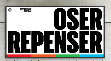
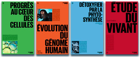
By unleashing our ingenuity, we are educating the leaders of tomorrow, pushing the boundaries of innovation and building a fairer, more sustainable world. It is by unleashing ingenuity, with courage and authenticity, that technological and social progress is achieved.
Elements of our brand identity
Main Logo


The Polytechnique Montréal logo consists of two words aligned to the right. The words are never in colour.
Clear space
For optimal visibility and recognition, the logo must be surrounded by clear space equal to the width of the “P” in “Polytechnique.” This exclusion zone must be kept free of any typographic, graphic or visual elements.
Alternative logo
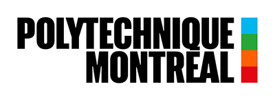
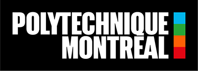
This variation pairs the logotype with a vertical colour strip and is used in specific contexts.
- Applications: When the logo appears alongside other logos, when the logo handles a major portion of the brand representation (where other brand elements like the colour strip or the seal are absent), or when visual impact needs to be reinforced.
- Technical limitations: The alternative logo should ideally be used on a black or white background, or on a very light or very dark background..
Seal


Function and symbolism
The seal is a symbol of prestige and institutional affiliation that ensures the visual consistency of the brand while recalling Polytechnique Montréal’s historical heritage.
Applications
The seal can be used on various communication materials, including flyers, posters, brochures, reports and other institutional documents.
- Positioning: It is placed discreetly in a corner of a visual, at the edge of a document or next to an image, without dominating the composition.
- Fixed proportions: At its minimum size, the seal must maintain the same height as the word "POLYTECHNIQUE" in the main logo. At its maximum size, it must never exceed the height of the main logo.
Ceremonial Version (Emblem)
Reserved for official documents like diplomas and ceremonial events such as convocation, the seal retains all of its emblematic elements (bee, laurels, Latin motto, etc.).
It can be seen, for example, displayed on screens during the graduation ceremony.
Colour palette
Inspiration and symbolism
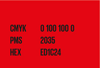
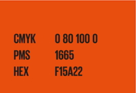
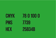
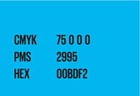
Polytechnique Montréal’s visual identity is based on a colour palette inspired by the Lassonde pavilions. Each colour has a symbolic meaning: red represents molten magma; orange, the earth; green, the plant world; and blue, the sky. This palette is a unifying element that endows the brand image with visual impact and dynamism, in keeping with Polytechnique’s contemporary vision.
Use of white
White is the main background colour in our visual identity guidelines, providing a clean and contemporary look that highlights the other visual elements of our brand.
Colour strip

General characteristics
- Emblematic: This distinctive element of our brand is part and parcel of the university’s physical environment and vividly reflects Polytechnique Montréal’s identity. It is adaptable and its size can be adjusted to fit the context.
- Pervasive graphic element: When detached from the logo, the colour strip becomes a central, recurring graphic feature in all Polytechnique communications.
- Orientation: It must always progress from magma to sky, whether in a horizontal or vertical format.
- Monochrome version: A single-colour version of the strip is available for communications focusing on a specific field of engineering.
Configurations
- The colour strip must be used in one of the following three configurations:
- Thin strip on the edge: The colour strip is positioned along one edge of the document. It can be placed at the top, bottom or left-hand side (opposite the main text). It must touch the edge of the page.
- Thin strip in an image: The strip is placed at the perimeter of an image, either at the top, bottom or side. Note that it must not extend to the edge of the page.
- Wide strip without image: This can be used only if there are no images in the layout.
Typography

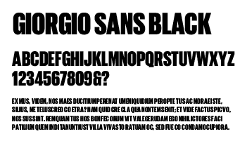

GIORGIO CONDENSED SANS (modified)
This font has been adapted specifically for Polytechnique Montréal. Accented capital letters and the letters Q and Ç have been custom redesigned to allow for tighter line spacing.
Usage: Giorgio is reserved for titles and subheadings. It is generally used in all-caps to enhance its visual impact, unless the text is long and presents readability challenges — in those cases, lowercase letters may be used.
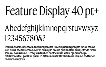


FEATURE CONDENSED
Chosen for its academic character and its invocation of knowledge, this font perfectly reflects the mission of Polytechnique Montréal.
Usage: Feature can be used for subheadings, introductions, and body text.



INTER
Chosen for its exceptional legibility and versatility, Inter is among the most widely used fonts in the world and has established itself in a variety of contexts, from digital interfaces to airport signage. Its refined design makes it a natural fit for Polytechnique Montréal's international ambitions.
Usage: Prioritize Inter for body text in newsletters, presentations, and web content. It is also suitable for print publications, ensuring consistency across all media.
For inquiries regarding Polytechnique Montréal's brand guide and its use, to obtain official logo files, or to request authorization for the production of items featuring the Polytechnique Montréal logo, please contact the Design Studio at studio@polymtl.ca.